
During Writing
Visual Accessibility: Using Color
Heather Caprette; Amanda Coolidge; Sue Doner; Amanda Goodsett; Josie Gray; Sarah LeMire; Barbara Loomis; Tara Robertson; Stephanie Tate; and Emilie Zickel
For some readers, using color can be a helpful way to spotlight or set off information. For example, changing the color of a word can make it stand out to your reader. However, certain considerations must be taken into account when using color in your teaching materials.
Key Considerations
- Have you used color to convey concepts or information? If so, you should confirm that you are not using color alone to convey this information
- Have you presented text- or image-based content on a colored or textured background? If so, you should confirm that there is sufficient contrast between your foreground content and the chosen background color or texture
- Have you included links in your content? If so, you should confirm that the color of your web links is distinct from both your background color and the color of the surrounding text
Color Alone Cannot Convey Information
While color can be useful to convey information, it should not be the only way that information is conveyed. Imagine that you have a worksheet that you are using to teach students about grammar. You want to spotlight certain words for emphasis, as in Example 1 below:
Example 1: Grammar Activity Using Only Color
The student turned in their homework.
There are too many people in this lecture hall.
In the example above, the words “their” and “there” are in red to help the reader see that these are the words of interest in each sentence. But for a reader who is using a screen reader or who is color blind, the words “their” and “there” may not stand out, making the exercise inaccessible to them. Instead of using color alone, you could make the text bold to help convey this information to the reader, as is depicted in Example 2.
Example 2: Grammar Activity Using Color and Bolding
The student turned in their homework.
There are too many people in this lecture hall.
You should not rely on color as the sole means of conveying information and instruction. If the point you are making depends on color to be understood, you will need to edit your materials so that concepts presented in the visuals are not lost to those who are color blind or who require high contrast between colors.[1]
Color Contrast
Color contrast refers to the hue, lightness, and saturation of text, images, and background. When documents or web pages do not provide enough contrast between foreground elements (e.g., text, images) and background elements (e.g., color, watermark images), some students will have difficulty reading the content.
Students with low vision and/or a form of color blindness may have difficulty reading text that does not contrast enough with the background color selected. If the color palette you have adopted is too subtle (e.g., white text on a pastel background; medium-grey text on a light-grey background), the contrast between your foreground and background is probably insufficient for some students.
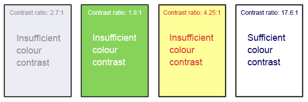
Level AAA of the “Web Content Accessibility Guidelines (WCAG 2.0)” requires that “the visual presentation of text and images of text has a contrast ratio of at least 7:1.”[2] Example 3 presents four different foreground/background color-contrast examples to illustrate insufficient and sufficient color-contrast ratios.
Example 3: Fonts and Backgrounds with Insufficient and Sufficient Color Contrast
There are many online and downloadable tools available to help you evaluate color-contrast ratios.
Tools for Testing for Color Contrast
- Color Contrast Analyzer by TPGI (the Paciello Group). Free download. Has an eye dropper tool to sample colors. Shows the contrast ratio of foreground text to background color. Evaluates for WCAG criteria. Also evaluates contrast for graphical user interface elements. Shows simulations for various color blindnesses. Has keyboard accessibility in addition to an eye dropper tool.
- WebAIM’s Color Contrast Checker: This web-based tool allows you to select or enter color values to test, and provides you with a “pass” or “fail” on your contrast ratio.
- ACART’s Contrast Checker: This is a straightforward, web-based tool you can use to both check color contrast and view your selections in greyscale. This tool also allows you to keep a history of the color combinations you have tested.
- Giacomo Mazzocato’s Accessibility Color Wheel: This web-based tool includes several options for testing your color selections, including simulations of three types of color blindness. You can also opt to test what your contrast ratio is when the foreground and background color selections are inverted.
Color in Graphs and Images
Consider what your images would look like if they were only displayed in black and white. Would any necessary context or content be lost if the color was “turned off?” Images should not rely on color alone to convey information; if your point requires color, you may need to edit or format the image so the concepts presented are not lost to those who are color-blind or require high contrast between colors.
NOTE: Use of blue and red color palettes, as opposed to shades of green, are usually better for people who are color blind to tell the difference between two colors.
Other techniques you can use to enhance the contrast and separation between images include variations on dashed or dotted lines on a line graph, and black or white outlines around bars on bar charts. Please also download and use the free tool Color Contrast Analyzer to check to see if you have enough contrast between colors. Color Contrast Analyzer will also show you what colors look like to people with various color blindness, or deficiencies in detecting red, green, or blue light.
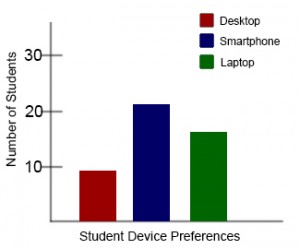
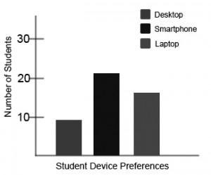
In Example 4, color is the only means by which information is conveyed. For students who are color blind, have poor contrast vision, or are using a black-and-white print copy (see Chart 2), relevant information is lost.
Example 4: Inaccessible Bar Chart


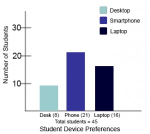
Students who are color-blind can distinguish between high-contrast shades. In Chart 5, contextual labels have been added to each bar at the bottom of the chart. Note that the chart will still require alt text.
Example 5: Accessible Bar Chart

Link Colors
Links must be visually distinct from both the surrounding, non-linked text and the background color. If you do not underline your links (or provide some other non-color cue), you must ensure that you provide sufficient contrast between the link and background colors and between the link color and that of the surrounding text.
Web Content Accessibility Guidelines (WCAG 2.0) require a:
- 4.5:1 contrast between the link text color and the background
- 3:1 contrast between the link text color and the surrounding non-link text color[3]
Testing Your Materials for Sufficient Contrast
Some students need to see light text on a dark background for it to be readable, while others require dark text on a light background. Students with low vision must be able to see content when it is displayed in high-contrast mode. This can be a subjective experience, based on individual student needs. We recommend testing your text- and image-based content as you go by using high-contrast mode on your computer and making adjustments as needed.
All content items such as text, images, bullets, and table borders must be visible in both regular and high-contrast modes.
How to Test Your Content in High-Contrast Mode
To test the visibility of your content in this mode, turn on high contrast by simultaneously pressing the following keys on your (PC) keyboard:
Left ALT + Left SHIFT + Print Screen.
To turn off high contrast mode, repeat this step.
This text was derived from
Loomis, Barbara, Heather Caprette, Stephanie Tate, Emilie Zickel, and Amanda Goodsett. Accessibility Toolkit for Authors of OER. Cleveland, OH: Pressbooks@MSL, 2023. https://pressbooks.ulib.csuohio.edu/accessibilitytoolkit/. Licensed under a Creative Commons Attribution-NonCommercial 4.0 International License.
Media Attributions
- Image with four examples of different font color against different background colors © Amanda Coolidge; Sue Doner; Tara Robertson; and Josie Gray is licensed under a CC BY (Attribution) license
- Inaccessible Bar Chart – Color Only © Amanda Coolidge; Sue Doner; Tara Robertson; and Josie Gray is licensed under a CC BY (Attribution) license
- Inaccessible Bar Chart – Insufficient Contrast © Amanda Coolidge; Sue Doner; Tara Robertson; and Josie Gray is licensed under a CC BY (Attribution) license
- Accessible Bar Chart © Amanda Coolidge; Sue Doner; Tara Robertson; and Josie Gray is licensed under a CC BY (Attribution) license
- "Web Content Accessibility Guidelines (WCAG) 2.0, Guideline 1.4.1 Use of Color," WC3, accessed June 7, 2018, http://www.w3.org/TR/WCAG20/#visual-audio-contrast. ↵
- WCAG defines three levels of minimum accessibility standards: A, AA, and AAA. AAA outlines the highest level of minimum standards for web accessibility. Large text can have a lower contrast ratio (4.5:1). In addition, text that conveys no information or is part of a logo has no color contrast requirements. See "Web Content Accessibility Guidelines (WCAG) 2.0, Guideline 1.4.6 Contrast (Enhanced)," WC3, accessed February 28, 2018, http://www.w3.org/TR/UNDERSTANDING-WCAG20/visual-audio-contrast7.html. ↵
- "WCAG 2.0 and Link Color," WebAIM, accessed June 7, 2018, http://webaim.org/blog/wcag-2-0-and-link-colors/. ↵
