
Before Writing
Considerations for Visual Accessibility
Gia Alexander; Justin Romack; Heather Caprette; Amanda Coolidge; Sue Doner; Amanda Goodsett; Josie Gray; Barbara Loomis; Tara Robertson; Stephanie Tate; and Emilie Zickel
Initial Considerations
This section explains how to structure a document and prepare its container, the means of output or publication (Canvas/LMS module, accessible PDF, etc.) to meet the needs of audience members who have visual disabilities.
How Do People with visual disabilities Access Digital Documents?
People who have visual disabilities (like blindness, low vision, and other visual impairments) typically access digital documents using the following three types of assistive technology:
- Screen magnifier: Software that enlarges the entire screen image or a designated section of the screen
- Screen reader: Text-to-speech software that describes what is on the screen and reads text aloud
- Braille output: Software that converts text to braille and exports it to a braille printer or a Refreshable Braille Display, essentially a braille computer keyboard.
When developing a document to be accessible to those with visual disabilities, it is helpful to provide or activate the following affordances:
- Tagged document structure using styles
- Font adjustment/enlargement option, where available
- Color and contrast adjustment option, where available
- Detailed alt text for all images
- Vibrant color within the document
- Output capability in alternative formats
Tagging
To “tag” a document means to assign specific structural attributes to pieces of text such as headings, links, and captions. Tagging a document makes it navigable via a screen reader. When it encounters a tag, the screen reader will not only read aloud the actual text but also tell the user what kind of text it is, such as a heading (with its level), a numbered list (with the number of items), a bulleted list (with the number of items), etc. Not tagging a document, e.g., leaving the entire text set to the Paragraph or Normal style, will obscure its structure and organization, making it impossible for a screen-reader user to navigate, even if you have formatted the document such that its different elements and sections appear visually distinct. Planning the structure (sections, levels of headings, etc.) ahead of time will help you tag consistently.
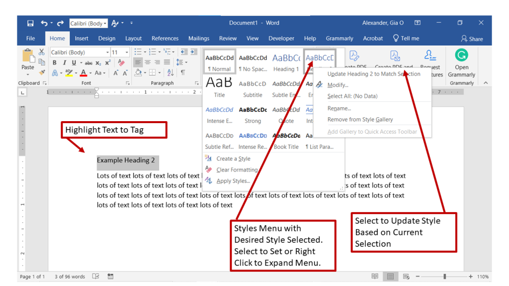
To tag a document, use the Styles function in the software you are using to create it. For example, you may follow these steps to tag a document in Microsoft Word:
- Select the text you want to tag.
- In the Home ribbon, navigate across to Styles.
- Use the drop-down function, if needed, and click on the type of style your selected text represents.
- Apply the chosen style consistently to all similar elements in your document.
In many cases, the formatting that Microsoft Word applies to your tagged text will be different from what you intended for your document. Don’t worry; you can change it. When you go to the Styles menu in the Home ribbon to select your style, you can right-click on the style. You will see a pop-up menu, and at the top, you will see an option to “Update <name of style> to match selection.” Now, all of your instances of text that correspond to that style will reflect your chosen formatting attributes such as font, bold, italics, color, etc.
The following annotated screenshot shows you how to tag a Heading 2 in Microsoft Word.
Tagging in other software such as Google Docs works the same way. You need only identify the Styles menu and then follow the same procedure described above.
Special Note about the Heading 1 Style:
Many times, users with visual disabilities will export documents to an accessible PDF using Adobe Acrobat, which recognizes only one Heading 1 (H1) tag per document. Therefore, a best practice when setting up any document for accessibility is to use the Heading 1 style in place of the Title style, and then use Heading 2 to tag the main sections.
For more information on using Styles, see Visual Accessibility: Using Styles.
Typography and the Font Enlargement Option
Use clear, standard, 12-point (minimum) fonts when creating accessible instructional materials. Avoid small or decorative/calligraphic fonts that are harder to read. Some serifed fonts, however, can be easier to read. Some good fonts to use include the following:
- Arial (PC)
- Helvetica (Mac)
- Times New Roman
Some software for designing accessible content for the web have built-in affordances that you simply need to turn on, or double-check to make sure they are turned on. One of these affordances offers users who have visual disabilities the option to enlarge the size of text on the screen. The typical button for this affordance displays two capital letter A’s with the first being smaller and the second larger, like this:

Some buttons will also have an arrow above the two characters pointing upwards and to the right.
When a user clicks on this button, the software automatically and incrementally enlarges all of the text on the screen; multiple clicks will continue to enlarge the text until the size ultimately cycles back to its original size.
If this feature does not appear automatically in your development software, you can often add it by selecting it from a Tools menu under Accessibility or in the accessibility checker built into the software.
Color/Contrast Adjustment Option
Similar to the font enlargement option, some document development software will also offer the option to use high contrast (see section on Using Color below). Activating this feature makes it easier for people with certain types of visual impairments to read the document; therefore, activating it constitutes another best practice for accessibility.
For more information on Typography, see Visual Accessibility: Typography.
Images
Functional Images and Alt Text
Functional images add content meaning to your document. Typically, students cannot understand your lesson’s overall message without analyzing these images. Some examples of functional images we commonly use in instructional materials include the following:
- Diagrams
- Maps
- Photos
- Schematic drawings
- Screenshots
When a screen reader encounters an image, it will read the alt text, a detailed description of the image, that you add to its metadata when you first insert it. When a screen reader encounters an image without alt text, it simply says “Image.” Of course, this is not helpful. Therefore, many software packages, including Microsoft products, will not allow you to complete image insertion until you populate the alt text field in the metadata. Here’s an example of what that looks like.
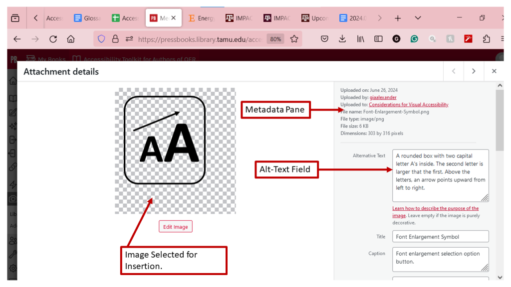
Alt text needs to be more detailed than the caption. Here are some best practices for writing helpful alt text:
- State what the image is, i.e., a box, a screenshot, a schematic, etc.
- Describe the layout of the elements in the image, typically working from top left to bottom right, and using a “drill down” technique where high-level aspects are frontloaded in the description, with more specific details to follow as necessary and appropriate.
- Explain and interpret any crucial data in the image that you want your student to understand. A best practice for composing this text is to imagine that you are describing the image and interpreting its data over the phone to someone who does not have access to it.
- (Optional, if applicable) Include information on the best way for students who have low vision to view the image. For example, you might write, “This image is best viewed at a screen resolution of 760 x 1024.”
Please resist the temptation to leave the alt text for later. We all have good intentions, but research shows that missing or inadequate alt text is the most common accessibility barrier in instructional materials.
It is also important to be aware that prepending “An image of” with your alt text is redundant, as assistive technologies will clearly communicate to a visually impaired individual that the item is, indeed, an image.
Please see Visual Accessibility: Using Alt Text for a more in-depth exploration of alt text.
Decorative Images
If an image does not add meaning, i.e., if it’s included for decorative or design purposes only, or if the image is adequately described in the caption and/or surrounding text, it doesn’t need an alt tag. Including alternative text descriptions for decorative images “simply slows the process down with no benefit because the screen-reading software vocalizes the content of the [alternative text description], whether that alternative text adds value or not.”[1] However, this doesn’t mean that you should leave an alt tag blank.
When a screen reader detects an image with a blank alt tag, it will read out the image file location. If The Wong-Baker Faces pain scale didn’t have an alt tag, a screen reader would say, “Graphic: https://opentextbc.ca/accessibilitytoolkit/wp-content/uploads/sites/184/2017/06/2049201506_0f9b17182a_o.jpg.”
You can add the null alt attribute to an image tag within Pressbook’s Text view.
- Click the Text tab.
- Locate the <img> tag for a decorative image you have just placed.
- Add a space after the ‘src’ attribute and write alt=”’ with no space between the quotation marks. This should cause the screen reader to not announce that there is a graphic present and skip over it.
- An example of what this could look like is: <img src=”images/flourish.gif” alt=””>
Using Color
Consider what your images would look like if they only displayed in black and white. Would any necessary context or content be lost if the color was “turned off?” Images should not rely on color alone to convey information; if your point requires color, you may need to edit or format the image so the concepts presented are not lost to those who are color-blind or require high contrast between colors. The use of blue and red color palettes, as opposed to shades of green, is usually better for people who are color-blind to tell the difference between the two colors in a data visualization.
Other techniques you can use to enhance the contrast and separation between images include variations on dashed or dotted lines on a line graph, and black or white outlines around bars on bar charts. Please also download and use the free tool Color Contrast Analyzer to check to see if you have enough contrast between colors.[2] Color Contrast Analyzer will also show you what colors look like to people with various color blindness, or deficiencies in detecting red, green, or blue light.
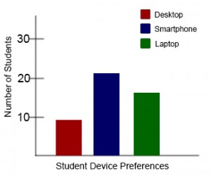
Example 1: Inaccessible Bar Chart
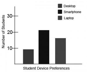
In Chart 1, colour is the only means by which information is conveyed. For students who are colour blind, have poor contrast vision, or are using a black-and-white print copy (see Chart 2), relevant information is lost.


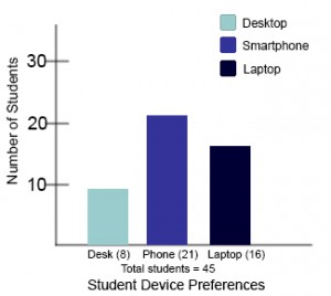
Example 2: Accessible Bar Chart

Students who are color blind can distinguish between high-contrast shades. In Chart 3, contextual labels have been added to each bar at the bottom of the chart. Note that the chart will still require an alt tag.
Please see Visual Accessibility: Using Color for more information about using color in your teaching materials.
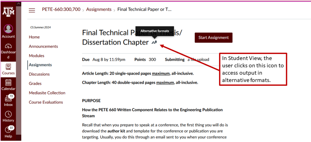
Output to Alternative Formats
Many learning-management systems, including Canvas, offer users the option to export materials to alternative formats such as an ePub or even braille. Here is what that option looks like in Canvas.
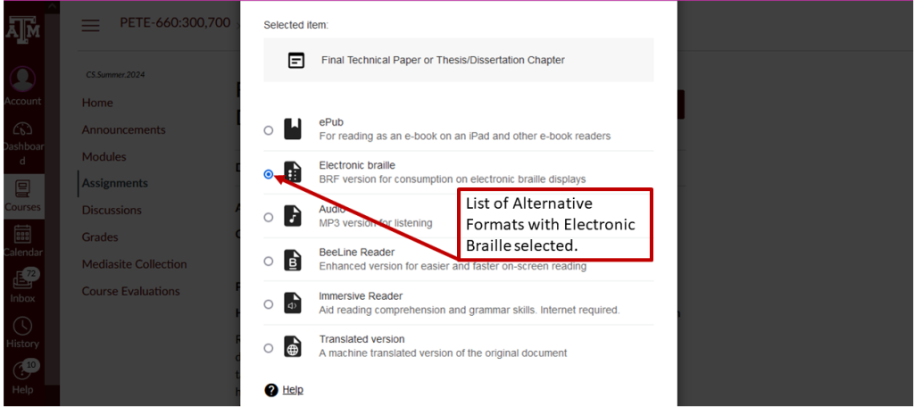
Students who use Electronic Braille can port their files to a braille printer (usually available in your university’s Disability Resources office) or to a braille keyboard known as a Refreshable Braille Display (RBD), which loads the text line-by-line, as shown below.

This text was derived from
Loomis, Barbara, Heather Caprette, Stephanie Tate, Emilie Zickel, and Amanda Goodsett. Accessibility Toolkit for Authors of OER. Cleveland, OH: Pressbooks@MSL, 2023. https://pressbooks.ulib.csuohio.edu/accessibilitytoolkit/. Licensed under a Creative Commons Attribution-NonCommercial 4.0 International License.
Media Attributions
- Screenshot of Styles feature in Microsoft Word 365 edition, June 26, 2024.
- Screenshot of font enlargement symbol, June 26, 2024.
- Screenshot of the AltText Metadata Pane feature of Pressbooks, June 26, 2024.
- Inaccessible Bar Chart – Color Only © Amanda Coolidge; Sue Doner; Tara Robertson; and Josie Gray is licensed under a CC BY (Attribution) license
- Inaccessible Bar Chart – Insufficient Contrast © Amanda Coolidge; Sue Doner; Tara Robertson; and Josie Gray is licensed under a CC BY (Attribution) license
- Accessible Bar Chart © Amanda Coolidge; Sue Doner; Tara Robertson; and Josie Gray is licensed under a CC BY (Attribution) license
- Screenshot of Alternative Formats feature in Canvas, June 26, 2024/
- Screenshot of list of alternative formats in Canvas, June 26, 2024.
- Refreshable Braille Display © Gia Alexander
- "Top 10 Tips for Making Your Website Accessible," UC Berkeley: Web Access, accessed March 27, 2018, https://webaccess.berkeley.edu/resources/tips/web-accessibility#accessible-alt. ↵
- TPGi, "Colour Contrast Analyzer (CCA), accessed 11 August 2024, https://www.tpgi.com/color-contrast-checker/. ↵
Learning Management System such as Canvas, Blackboard, Moodle, or Google Classroom which is intended to host and communicate teaching materials, student work, and grades for courses.
Assistive technology is any item, piece of equipment, software program, or product system that is used to increase, maintain, or improve the functional capabilities of persons with disabilities.[1]
Assistive technology (primarily software) which converts text, images, etc. into alternative output such as speech or braille.
Text-to-speech software takes the text on a screen and reads it aloud to the audience. While screen reader software will read or describe everything on a screen, text-to-speech softwardprovides a smaller and more focused version -- often just reading text when selected or just the text of a document.
An altnernate writing system read with fingers. Usually displayed using embossed paper or a refreshable digital display.
A refreshable braille display or RBD is a tacticle device that takes input from a copmuter, phone, etc. and gives an output in braille that is not permanent, but can be updated as the text output changes.
Tagging a document is a way of marking up a document (often in the background, metadata, or otherwise invisible formatting information) to indicate different sections or types of information within a document. For instance, tagging a PDF might indicate the heading, an image, body text, page number, etc. and make assistive technolgy better able to interpret the layout of the document.
A style in Word, Google Docs, Pages, or similar is the collected details of formatting applied to text of a certain type or level, such as "body text" or "heading 2." Using styles allows a document to be quickly and consistently formatted, enables the ability to create a clear structure and generate a table of contents, and -- most importantly -- assists with the accessibility and navigation of documents.
The information connected to a file that may not be part of the main function of a file. A file's metadata might include its date or location of origin, the title of certain types of files, or file ownership or modifications.
