
7 Visualizing Data
Learning Objectives
- Explain how visualizing data is useful
- Evaluate the strength and weaknesses of graphical data summaries as evidence for decision making
- Create graphical summaries of data sets with the ggplot2 package
Chapter content
This chapter describes the purposes and usefulness of visualizing data and introduces ggplot2 in R for creating graphs. Visualing data has two primarily purposes: communication and exploratory analysis.
Communicating with graphs
Graphs and visualizations are highly effective tools for communicating data analysis because they transform complex, abstract information into clear, accessible visuals that audiences can quickly understand and act upon.
Reducing Cognitive Burden
Visual methods, when properly designed, significantly reduce the cognitive effort required to interpret data. Instead of sifting through lengthy tables or dense text, viewers can instantly grasp patterns, trends, and relationships-such as changes over time, correlations, or comparisons between groups-thanks to the intuitive nature of charts, graphs, and maps.
Revealing Patterns and Trends
Graphs highlight key insights that might be hidden in raw numbers. For example, line graphs can reveal trends, bar charts can compare categories, and scatter plots can show relationships between variables. This visual clarity helps analysts and stakeholders spot outliers, trends, and areas needing attention much faster than with traditional data formats.
Enhancing Communication and Engagement
Visualizations bridge the gap between technical and non-technical audiences, making data-driven findings accessible to everyone. They support storytelling by turning data into narratives that are memorable and engaging, improving retention and fostering better collaboration across teams.
Facilitating Faster and Better Decisions
By simplifying complex datasets, visualizations enable quicker, more confident decision-making. Interactive dashboards and real-time graphs allow organizations to monitor performance, detect anomalies, and respond rapidly to emerging issues.
Exploratory analysis with graphs
One purpose of visualizing data is to explore a data source. Exploratory analysis helps the analyst discover aspects of how the data was collected, the characteristics of observations in the sample, and important patterns in the data that vary over time or across groups of observations. These analyses tell the context from which results emerge. These analyses also alert the analyst to problems that may exist when using the data.
Exploratory analysis with graphs may start with high level information about the sample and then progress to analyses that describe important variables for subsequent analysis. With each step the data analyst searches for the story behind the data.
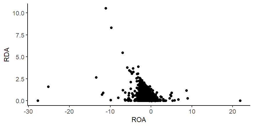
The examples below present aspects of a data set that a data analyst might graph and questions that a data analyst might ask to explore the data set. This data set is from a large database of annual financial statements for public companies and includes company name, fiscal year, an industry code, return-on-assets (ROA) which is net income divided by average total assets, and research and development expense divided by average total assets (RDA).
The examples include various types of graphs that may be commonly used in exploratory analyses.
Number of observations
Perhaps the first exploratory analysis in most cases is used to understand the sample including the degree to which it is representative of the population of interest, the degree to which the data is complete, and the degree to which the sample varies across subsamples. One way to understand the sample is by counting the number of observations that meet specified conditions. The following examples describe the number of observations in various ways and across different dimensions. Each example includes hotspots that highlight questions that the data analyst might ask to better understand the data.
Total observations and observations with non-missing values
Number of observations by group (industry)
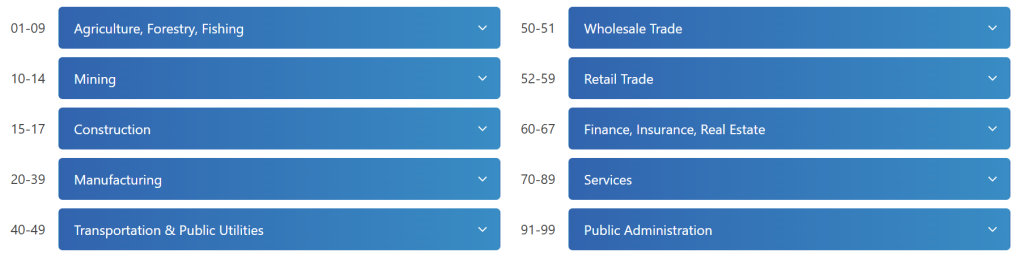
The data set contains standard industrial classification codes (SIC). SIC codes are industry classifiers that are often used to classify companies. Various websites provide the decoding of SIC codes. The classifications shown below are from https://siccode.com/sic-code-lookup-directory.
The next graph uses the first two digits of the SIC code to explore the number observations by industry only for observations that have non-missing RDA.
Number of observations by group (year)
The next graph shows the number of observations by fiscal year only for observations that have non-missing RDA.
Variable distribution
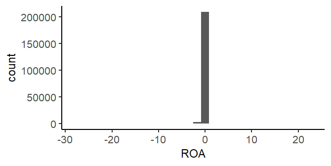
After exploring the sample, the typical next step is to explore the variables that will be used in the analyses. Exploring the variables includes undertanding the possible values, the distribution of values, and differences across subsets of data. The following histogram plots the distribution of ROA for observations that have non-missing ROA.
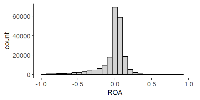
The next histogram focuses in on ROA nearer to the center of the distribution.
Comparing the first and the second histogram suggests that subsequent steps might need to carefully consider extreme outliers of the ROA distribution.
Variable aggregates
After exploring the distribution of a variable, the next step is usually to understand other features of the variable, for example, changes in the variable across subsets of data.
ggplot2
The ggplot2 package in R is a powerful and flexible data visualization tool created by Hadley Wickham. The package breaks down visualizations into composable elements (data, aesthetics (how data variables are mapped to visual properties like position or color), and geometric objects (the type of plot, such as points, lines, or bars)). The ggplot2 website provides tutorials, information about the package, and examples: https://ggplot2.tidyverse.org/. This section demonstrates how to use the ggplot2 package first with some general principles and then by example.
A ggplot2 visualization has three primary components that are required and to which variations may be added. Click on the hotspots in the following code to learn about these primary components.
The examples below use the basic ggplot2 structure and then add variations to the basic structure. The code examples below use an altered version[1] of the data from the previous section that is available for download here: https://www.dropbox.com/scl/fi/g7gmo0jgj797lwk5b0ltr/ROARDA.csv?rlkey=1rk4cjb0n6ezby4e3y1gicure&st=vg1e4qk2&dl=0.
Scatterplot
Suppose you want to create a scatterplot of RDA as the y-axis and ROA as the x-axis. The code above can generate this with the data frame above.
ggplot(df)+geom_point(aes(x=ROA, y=RDA))
Variations to the simple example above can alter the look of the graph. For example, your plot may look different than the one above because it uses a specific theme and set of options. This is the one used here and above:
theme_set(theme_classic())
theme_update(axis.title=element_text(size="10", color="black"), legend.position="bottom",
plot.title=element_text(size="12",color="black",hjust = 0.5),
plot.subtitle=element_text(size="10",color="black",hjust = 0.5),
plot.caption = element_text(size="10",hjust = 0),
panel.grid.major = element_blank(),
panel.grid.minor = element_blank())
This code can be run once at the beginning of an R session and it will affect all subsequent graphs.
Other common options alter the size or color of the points:
ggplot(df)+geom_point(aes(x=ROA, y=RDA),size=1,color="grey")

Additional options can customize the graph, for example by adding titles, labels, or captions like the following:
labs(title = "Scatterplot",
subtitle="RDA x ROA",
caption = "This graph plots RDA x ROA for public companies from 1990-2024.",
x = "Return on assets", y = "Research and development expense")
Other examples
Other graphs can be done with the same set up but with a different type of graph. Sometimes the data needs to be prepared differently to create the graph. Some common examples are shown below.
Histogram
ggplot(df)+geom_histogram(aes(x=ROA))
ggplot(df)+geom_histogram(aes(x=ROA),color="black",fill="lightgrey")+xlim(-1,1)
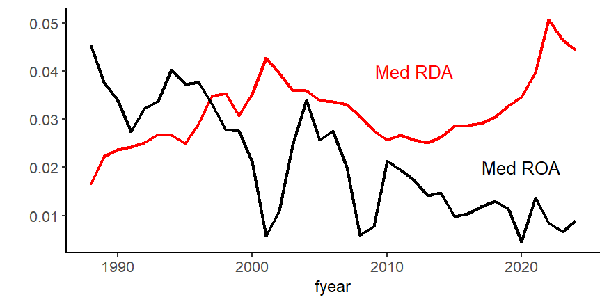
Line plot
tmp<-df %>%

group_by(fyear) %>%

summarize(

MDRDA = median(RDA, na.rm = TRUE),

MDROA = median(ROA, na.rm = TRUE)

)

ggplot(tmp)+geom_line(aes(x=fyear, y=MDRDA),size=1,color="red")+

geom_line(aes(x=fyear, y=MDROA),size=1,color="black")+

labs(x="fyear",y="")+

annotate("text",x=2012, y=0.04, label = "Med RDA", color="red") +

annotate("text",x=2020, y=0.02, label = "Med ROA", color="black") ggplot(df)+geom_line(aes(x=ROA, y=RDA),size=1,color="red")
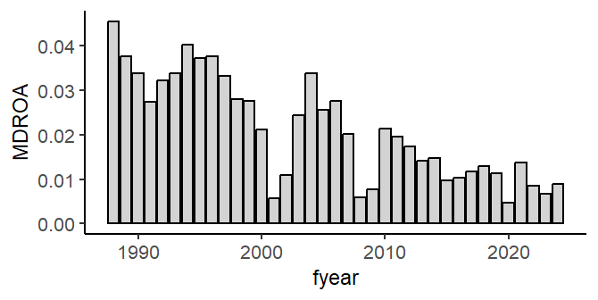
Bar chart
Use the same tmp data frame from above.
ggplot(tmp)+geom_bar(aes(x=fyear, y=MDROA),stat="identity",color="black",fill="lightgrey")
Conclusion
Visualizing data and data analysis results can be powerful ways to explore data and to communicate information. ggplot2 provides tools that make creating and customizing a wide range of graphs flexible and fast.
Review
Mini-case video
References
https://r4ds.hadley.nz/EDA.html
Media Attributions
- siccodes
- ScatterPlotRDAROA
- AlteredRDAROA
- ROAHistogram
- AdjustedROAHistogram
- RDAROA lineplot
- BarChart
- Specifically, this version has non-missing average total assets (the denominator for RDA and ROA) and must be greater than $10 million. ↵