8 – Graphics
Figures
Suzan Last; David McMurrey; Kalani Pattison; James Francis, Jr.; Nicole Hagstrom-Schmidt; Matt McKinney; and Gia Alexander
Figures comprise several types of visuals. Examples include nearly any visual that is not text-heavy or a table, such as graphs, charts, maps, and diagrams. The following sections will cover the most common types of figures in detail, as well as their potential utility in technical and professional writing.
Types of Figures and Appropriate Uses
Different figure types have different strengths and uses. For example, you would not use a pie chart if you were presenting data that could not add up to 100%, and you would not use a bar graph to show the layout of a community garden. Table 8.1 lists common figure types used in technical writing, along with their general purpose or description. [1]
Table 8.1. Common types of illustrative graphics
| Type of Visual | Description and Purpose | |
|---|---|---|
| Graphs | Bar Graph | Compares and contrasts two or more subjects at the same point in time, or compares change over time. |
| Column Graph | Reveals change in a subject at regular intervals of time. | |
| Line Graph | Shows the degree and direction of change relative to two variables; compares items over time, shows frequency or distribution, or shows correlations. | |
| Charts | Pie Chart | Displays the number and relative size of the divisions of a subject; shows relation of parts to a whole (parts must sum to 100% to make sense). Typically pie charts will include between three and eight slices. |
| Organization chart | Maps the divisions and levels of responsibility or hierarchy within an organization. | |
| Flow Chart | Shows the sequence of steps in a process or procedure. | |
| Gantt Chart | Indicates timelines for multi-stepped projects, especially used in proposals and progress reports. | |
| Illustrations | Diagram | Identifies the parts of a subject and their spatial or functional relationship; emphasizes detail or shows dimensions. |
| Photo | Shows what a subject looks like in realistic detail or shows it being used. | |
| Animation | Simulates a process, operation, or incident. | |
| Film Clip | Depicts a process, operation, or incident in realistic detail. | |
Note: Notice the “box heads” on the top and “stubs” on the left are bolded and centered to enhance readability.
Common Uses of Graphics in Technical Documents
As with any writing decision, use your audience as your guide. Where in technical documents (such as instructions, reports, and proposals) could your reader benefit from visual clarification? Table 8.2 below reviews common types of information that may be clarified by the use of graphics.
Table 8.2. Common places for graphics in technical documents.
| What You are Writing | Graphic Ideas |
|---|---|
| Results of a survey question | Table, chart, or graph |
| Numeric data in relation to two or more things | Table, chart, or graph |
| Definitions of multiple terms | Table |
| Chain of command or relationships in an organization | Organization chart |
| A complex process or procedure | Flow chart |
| A timeline for completing a project | Gantt chart |
| An important piece of equipment | Photograph or diagram |
| A specific geographic location | Map |
If you’re not sure where you could incorporate a figure, remember that charts and graphs are just another way of presenting the same data that is presented in tables. The advantage of graphs and charts is that they are more dramatic and interesting; however, this strength may come at the cost of detail or precision, where tables excel. Imagine the difference between a table of sales figures for a ten-year period and a line graph for that same data. In the graph, you get a better sense of the overall trend but not of the precise dollar amount.
Drawings, Diagrams, Photos
To depict objects, places, people, and the relationships between them, you can use photos, drawings, diagrams, and schematics.
Major types of illustrations and photographs run from minimal to maximal detail. A simple line drawing of how to graft a fruit tree reduces the detail to simple lines representing the hands, the tools, the graft stock, and the graft. Diagrams are more abstract, schematic views of things; for example, a diagram of a car engine hardly resembles the actual physical thing at all. Photographs, of course, provide the most detail of all. These graphics, supplying gradations of detail as they do, have their varying uses. Here are some examples:
- In instructions, simple drawings (often called line drawings because they use just lines, without other detail such as shading) are the most common. They simplify the situation and the objects so that the reader can focus on the key details.
- In descriptions, you would want to use drawings, but in this case drawings with more detail, such as shading and depth perspectives.
- In feasibility, recommendation, and evaluation reports, photographs are often used. For example, if you are recommending a photocopier, you might want to include photos of the leading contenders.
The ethical responsibility to promote diversity arises when incorporating photographs into technical documents. When using photos, work to achieve a balance of representations throughout your document, including both men and women, older and younger people, people using assistive technology like wheelchairs and people of color.
Effective Formatting and Design for Figures
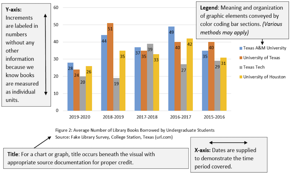
When you create charts and graphs, keep these requirements in mind (most of these elements are illustrated in Figure 8.3 [2]below):
Labels. Certain figures contain labels—words and phrases—with pointers to the parts of the things being depicted. In bar charts and line graphs, don’t forget to indicate what the x- and y- axes represent. One axis might indicate millions of dollars; the other, five-year segments from 1960 to the present.
Keys or Legends. If the illustration has certain shadings, colors, line styles, or other details that have a special meaning in the illustration, these should be indicated in a key or a legend—an area in an unused corner of the illustration that deciphers their meaning.
Titles. Except in special cases, illustrations should have titles, and these titles should be numbered (Figure 1, Figure 2, and so on). The exceptions are these:
-
- If you have lots of illustrations (for example, in certain instructions, there are illustrations practically after every paragraph) and if there is no benefit from the titles
- If you only have one or two illustrations and they are not cross-referenced
- If you do not cross-reference your illustrations.
In some of these cases, you might want to keep the title but discard the word “Figure” and the number following it. The title of a figure goes in a caption below the figure.

Cross-references. Almost all illustrations should be referred to from the relevant point in the discussion. Prior to providing the graphic, identify its purpose and explain any relevant details for your readers.
Location within the report. Figures should be placed just after the point where they are needed. However, sometimes because of the pagination (the way the text falls on the pages) and the size of the illustrations, this close placement is not possible. If this occurs, place the graphic at the top of the next page. Your figure numbers and cross-referencing will make it clear what information the graphic is associated with.
Size of illustrations. Ideally, you want illustrations to be between one-quarter to one-half of the vertical size of the page. You also want them to fit on the page with other text. In fact, that’s what you really want—to intersperse text and graphics in a report. Extremely large figures may need to be resized, revised to focus on specific information, or placed on their own page.
Placement within margins. Make sure that your illustrations fit neatly and comfortably within standard (usually one-inch) margins. You don’t want the illustration spilling over into the right or left margins. You want to allow the equivalent of at least two blank lines above and below the illustration.
Level of technical detail. Design your figures to be at the right technical level for your readers. For example, a chip circuitry diagram for an audience of computer beginners would likely be too complex.
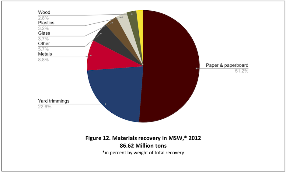
Design. Avoid unnecessarily convoluted, distracting, or misleading design elements. For instance, don’t use 3D for figures such as pie charts or bar graphs. A 3D pie chart can distort the impression that the size of the slices makes, and 3D bar graphs can make it difficult for the reader to tell whether to read from the “front” or the “back” of the bar. See Figure 8.4[3] for a good example of a pie chart with clear slices, labelling, and design.

Accessibility/Usability. Be sure that your figures are accessible to a wide variety of readers and in a variety of formats. In addition to using actual text rather than pictures of text and including alternative text where needed, choose your colors wisely. While different shades of the same color may look nice, those shades may be easily misread if they are too similar. Combinations of red and green or yellow and blue may make it difficult for those with the most common types of color-blindness to determine the figure’s meaning. Remember that clear communication is the most important consideration in design choices.
This text was derived from
Last, Suzan, with contributors Candice Neveu and Monika Smith. Technical Writing Essentials: Introduction to Professional Communications in Technical Fields. Victoria, BC: University of Victoria, 2019. https://pressbooks.bccampus.ca/technicalwriting/. Licensed under a Creative Commons Attribution 4.0 International License.
McMurrey, David. Online Technical Writing. n.d. https://www.prismnet.com/~hcexres/textbook/. Licensed under a Creative Commons Attribution 4.0 International License.
- For a detailed discussion of how and when to use these kinds of visuals, see H. Graves and R. Graves, “Communicating through Visuals,” in A Strategic Guide to Technical Communications, 2nd ed. (Peterborough, ONT: Broadview Press, 2011), 137-148. ↵
- James Francis and Sarah LeMire, “Example of a Graph,” 2020. Licensed under a Creative Commons Attribution-NonCommercial-ShareAlike 4.0 International License. ↵
- U.S. Environmental Protection Agency, Office of Resource Conservation and Recovery, “Figure 12. Materials recovery in MSW,* 2012 86.62 Million tons,” in Municipal Solid Waste Generation, Recycling, and Disposal in the United States Tables and Figures for 2012, February 2014, 46. https://archive.epa.gov/epawaste/nonhaz/municipal/web/pdf/2012_msw_dat_tbls.pdf ↵

