
Presentation Options and Design
Quite often, you will have to prepare visual materials to accompany your talk. You might prepare handouts, but it is even more probable that you will need to prepare materials that can be projected on a video screen. The classic version of these projected materials is the overhead transparency, a thin sheet of clear plastic that you can run through a laser printer or write on with special markers; this medium is quickly disappearing, although it still surfaces. Sometimes, you might be able to project paper documents to a screen via a document camera, but doc cams are becoming less common, and they can only present static images. Instead, you will most likely be asked to create a dynamic presentation using software such as PowerPoint, Prezi, or Keynote. Many other programs exist, including what Google has to offer, but these are among the three most common presentation programs. Each program has its own special abilities and strengths; however, they all share common basic principles that you can use to create memorable, effective, and interesting presentations. The following information will help you with selecting an effective presentation format.
Three Major Presentation Formats
For a presentation using PowerPoint, Prezi, or Keynote, you can choose from three general formatting options: 1) bullet points, 2) illustrated points, and 3) speaker’s prop. The format you choose should fit your audience and your presentation’s subject.
Bullet Points
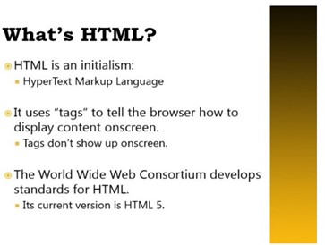
The bullet points format is the default layout for most PowerPoint users and viewers. Slides created in this format commonly include a title across the top and a cascading series of bulleted lines of text inside a slide’s main text box. Here is an example of this kind of slide.
Bullet points format presentations have several benefits. First, they are easy to prepare. (Just type, press Enter for a new line and hit Tab to create a smaller bullet or Shift+Tab to make a larger bullet.) Secondly, they are useful for highlighting important words or naming concepts that an audience needs to learn. Finally, they project a serious tone and sense of professionalism. As you consider these options, keep in mind that bullet points format presentations may be boring unless precautions are taken to keep the audience engaged; an overload of words may also make your audience cringe or lose interest. You have probably endured at least one bad PowerPoint in your life, and odds are, that bad presentation used the bullet points format.
Illustrated Points
The illustrated points format is similar, but slides created in this type of presentation focus on pictures, and text appears in a supporting role. An example of this kind of slide appears below.

Illustrated points format slides have several benefits. They are excellent for showing conceptual relationships or demonstrating physical relationships between objects. People often respond positively to pictures, so illustrated points format slides also tend to capture viewers’ interest more than all-text presentations do. These slides require more detailed preparation, however, and they tend to be more visually busy. If your audience has problems concentrating, if you need to highlight important words, or if you need to move quickly through the information on the slides, you may want a more text-based approach. Illustrated points format slides can also be combined with bullet points format slides inside the same presentation.
Speaker’s Prop
The speaker’s prop format is similar to the illustrated points format, but a speaker’s prop almost entirely of simple pictures that flash onscreen in rapid sequence. Any text that appears is very short, uses a large font, and only appears for a moment. A speaker’s prop is appropriate for abstract subjects (e.g., the nature of free will), and if it is done well, it can be fascinating and will engage an audience. However, this type of presentation is often more complex and time-consuming to prepare than a presentation in the other formats, and you run the risk of making it so entertaining that the audience may remember the presentation but forget what you said.
Whichever format you choose, remember that the presentation software is your servant; do not let it tell you what to do, and always modify a template to suit your needs. As an excellent example of what not to do, consider Peter Norvig’s classic Gettysburg PowerPoint: (https://norvig.com/Gettysburg/).
It serves as a satirical example of how an excellent speech—in this case, Abraham Lincoln’s famous Gettysburg Address, widely considered one of the classic speeches in the English language—can be ruined by using presentation software default settings and following a built-in template without modifying it.
Slide Design Tips
The guidelines in the design chapter—CRAP in particular—will help you create consistent, helpful, and visually appealing slides. But all the design skill in the world will not help you if your content is not tightly focused, smoothly delivered, and visible. Slides overloaded with text and/or images will strain your audience’s capacity to identify important information. Complex, distracting transitions or confusing (or boring) graphics that are not consistent with your content are worse than no graphics at all. Here are some general tips:
- Think simplicity. Use a small number of high- quality graphics and limit bullet points and text. Also avoid thinking of a slide as a page that your audience should read; instead, elaborate on major points with examples to keep the presentation interesting and pare down text as much as possible. Remember: even if you are presenting a slideshow, you want the audience to pay more attention to your words than to the slides themselves. Too much text will make the audience concentrate on reading slides instead of listening carefully to the verbal information.
- Break up your information. Organize the information into small chunks of text—phrases rather than complete sentences—to make sure your presentation flows well. Some experts recommend having no more than five bullet points per slide. If you do have more than five, you may want to set up the bullet points to appear a few at a time (in order, on separate slides, or in different columns) to avoid the distraction of a longer list.
- Have a consistent visual theme. Some pros advise that you avoid using the stock PowerPoint templates, but the Repetition and Alignment aspects of CRAP are so important that the templates may be your best starting point.
- Choose a simple color scheme. In general, three to six colors should provide variety without overloading readers. Be consistent in how you use the colors. For example, if you use red font for the first 12 slides, you should probably not switch to blue font in the last 12 slides unless there is a clear and logical reason for doing so.
- Choose your font carefully. Make sure the text is readable from a distance in a darkened room. Many guidelines suggest that you use at least a 24-point font. Contrast is also important; place dark font on a light background or vice- versa.
- Practice your presentation. Software is only a tool, and the slide projector is not presenting—you are in charge. Realizing this is half the battle.
- Use graphics. In general, substantive slides should present a graphic that illustrates or supports your main point. Instead of the typical topic and bullet point slide layout, a more effective strategy for PowerPoint presentations slides may involve offering a claim backed by visual support in the form of a photo, graph, illustration, chart, etc.
- Be careful not to overload the slide (with either too much text or too many graphics). There is not necessarily one rule of thumb for how much is too much but be deliberate with choices.
Pitfalls of Presentation Software
Since Microsoft introduced PowerPoint in 1990, the conference room has never been the same. Millions were amazed by the speed with which a marketing professional or an academic could put together a consistent, professional-looking slide presentation. And then . . .
At some point, somebody with critical thinking skills asked a great question: “Do we really need all these slide shows?” The stock images of arrows, business people in suits, stick figures scratching their heads, and the glowing, jewel-toned backgrounds eventually looked tired and failed to evoke the “wow” reaction presenters desired.
Microsoft is attempting to refresh the design options for PowerPoint, and there are dozens of good alternatives, some of them free (Keynote, Slide Bureau, Prezi, SlideRocket, Easel.ly, Emaze, Slidedog). But the fundamental problem remains—text-heavy, unfocused, long presentations are the problem, not the software. If you are sure that a visual presentation will provide something necessary to your audience, keep the number of slides and the amount of text on each slide to a bare minimum. Think of a slide presentation as a way of supporting or augmenting the content in your talk; the slides should not replace your content.
Above all, do not read the slides to your audience, which is considered one of the single most annoying things a presenter can do; it also makes the presenter seem unprepared. Excessively small text and complex visuals (including distracting animations) are also frequently cited as annoyances. Instead, make sure that viewers can read slides easily from the back of the room. Also try to design your slides so that they contain information that your viewers might want to write down. For example, good presentations often contain data points that speakers cannot just rattle off or quick summaries of key concepts that viewers will not be able to make up on the fly. If you cannot explain how the slides add value to your presentation, it might be best to avoid using them altogether.
To get a feel for what may annoy your audience, try Googling “annoying PowerPoint presentations.” Also consider designing your presentation to allow for audience participation instead of passive viewing of a slideshow—a good group activity or a two- way discussion is a far better way to keep an audience engaged than a stale, repetitive set of slides.
In summary, a tool is only as effective as the person using it. Presentation software like PowerPoint does not make students stupid and professors boring; rather, poor use of this tool makes for ineffective presentations and can lead to laziness in both the audience and the presenter. Many of the problems with presentations result from readily accessible tools being used by individuals untrained in rhetorical and visual design. Fortunately, students of technical communication can implement a change of strategy to make presentations more effective.
Remember
- Keep slides and the text on them to a minimum.
- Do not read your slides.
- Make sure slides can be read from the back of the room.
- Include information you want the audience to write down.
- Consider audience participation.
Media Attributions
- Private: Figure 37: Slide organized around a cascading series of bulleted lines of text.
- Private: Figure 38: Slide that utilizes illustrated points format. emphasizing pictures with text in a supporting role.
