
Visual Design
Visuals can express or convey information in ways that words cannot. They can help make abstract concepts concrete for readers, therefore, as a professional and technical communicator, knowing how to use visuals is to your advantage. Visuals can work to help readers see what something looks like without having to describe it in writing. Photos, illustrations and maps can more succinctly orient a reader than words alone. Visuals are also effective in representing data through easy-to-understand charts, tables and graphs or diagrams. Visual design is not document design, but is rather a compliment to document design, both of which strengthen information design. We build our written communication artifacts out of visual elements such as the black text on the white background, the use of drawings, graphs, tables, illustrations etc. These are interconnected elements that when effectively applied can aid in understanding. Effective visual design improves usability by helping viewers to understand information more quickly and directly and helps them locate information quickly. Additionally, effective visual design influence a viewer’s attitude in a positive manner making them more receptive to the communication and subject matter. Remember, even colors and shapes suggest mood. Anything you can do to increase the audience’s interest, focus, or comprehension would be appreciated, and an appreciative audience is more favorably inclined toward your document.
Why does Visual Design Matter?
The answer is all around us really—more and more of our communication is visual. Think about how much time we spend on computers of any format—mostly phones these days. These devices are often almost entirely visual—there is very little tactile feedback outside of vibration. Visuals are more interesting than text. Text is abstract and reading requires extended concentration. It takes time and effort for readers to follow a textual message. Visuals, on the other hand, are immediate and viscerally engaging. This visceral appeal is a key aspect of what makes visuals so useful, even in professional and technical writing. Visuals present data to your audience for quick access and interpretation in a tidy, eye- catching package. Visuals are interesting.
Concurrent with this rise in the visual is the rise in the prestige of certain visual designs. It isn’t enough to have a phone—you need a phone looks awesome. Sometimes, even the manufacturers of these phones get caught up in this, embracing trendy choices without necessarily thinking about the usability of something like a fingerprint sensor on the back of phone or a notch carved out of the top of the screen. This can go even deeper than visuals—think about how small your phone’s thickness is compared to a phone from five years ago. I wonder how much more battery life we’d all have if our phones were the same thickness but had the more advanced batteries we use today.
However, like the textual design elements, visuals should be used thoughtfully and sparingly. Not only will the impact of the visuals be diminished through overuse, but your document may seem to lack deep analysis or critical thought, more like a comic book than a technical report. Think of visuals as the life of the party; they’re exciting, but they can get really annoying after a while.
Visual Design Decisions
The principles of effective writing—clarity, conciseness, directness, etc. are equally important to consider when using visuals. When you are making design decisions regarding visuals, you have two decisions to consider:
- What type of visual will be most useful and appropriate for your audience?
- Where will the visual be most effectively placed to serve your purpose?
Assessing the audience and understanding the purpose also applies to using visuals. Clear visuals with appropriate context such as introducing and discussing the visual can help readers focus on key elements of your document, presentation, or website. Visuals without context run the risk of being overlooked or misunderstood; even the most appealing visual will not help you if the reader does not understand what it is or why it’s there. As you consider purpose and audience, keep in mind that the same data can accomplish different purposes for different audiences depending on the visual design you choose.
For example, if you have data that describes the environ-mental impact of runoff from commercial farming, an audience of technical experts might want to see a table or line graph describing the amounts of different types of runoff over time, but a lay audience might benefit from an infographic that visualizes the sources of run-off in different seasons. Same data, completely different visuals to suit different audiences’ needs.
- Additionally, visual elements should be surrounded by sufficient passive space (or “white space) to emphasize the image and enhance its readability. If copying and pasting an image, make sure all elements are clear, and the print size is readable. A visual that has been shrunk down to an unreadable size does not help the reader understand your ideas. If at all possible, try to orient the visual image in the same direction as the body text.
- Integrating Graphs, Charts, Tables, and Other data Displays
- Knowing which kind of visuals to use is as important as knowing when to use them. The most common types of graphic visual aids may be grouped into five different categories, each with its own unique purpose:
- Tables
- Graphs
- Charts
- Illustrations
- Numerical Equations
- See Table 12 below which provides an overview on the graphics most suitable to convey specific types of information.
| Type of Visual | Subtype | Description and Purpose |
|---|---|---|
| Tables | Place detailed data/information in categories formatted into rows and columns for comparison; use when exact figures are important. Label column headings (box heads) and/or row (stubs). | |
| Graphs | Bar Graphs | Compare and contrast two or more subjects at the same point in time, or compare changes over time. |
| Column Graph | Reveal change in a subject at regular intervals of time. | |
| Line Graph | Show the degree and direction of change relative to two variables; compare items over time, show frequency or distribution, or show correlations. | |
| Charts | Pie Chart | Display the number and relative size of the divisions of a subject; shows relation of parts to a whole (parts must sum to 100% to make sense). |
| Org. Chart | Map the divisions and levels of responsibility or hierarchy within an organization. | |
| Flow Chart | Show the sequence of steps in a process or procedure. | |
| Gantt Chart | Indicates timelines for multi-stepped projects. especially used in proposals and progress reports. | |
| Illustrations | Diagram | Identify the parts of a subject and their spatial or functional relationship; emphasize detail or show dimensions. |
| Photo | Show what a subject looks like in realistic detail or show it being used. | |
| Animation | Simulate a process, operation, or incident. | |
| Film Clip | Depict a process, operation, or incident in realistic detail. |
Tables
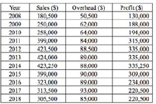
Tables allow you to display and compare data in an efficient, compact format that is organized and easy to read. Table 13 supplies a company’s sales, overhead, and profit over a period of ten years.
The information in Table 13 represents a decade of information about three different data points, and puts those figures in conversation with each other, allowing the audience to draw some quick conclusions about financial trends within the company. The body text of the document in which this table would be included would explain the data and conclusions in more detail, but the key information may be gleaned with a glance at the table.
Effective tables should:
- Display exact quantities of data clearly and accurately
- Display descriptive column and row labels
- Present multiple variables
- Compare sets of data to each other
When deciding whether or not to use a table, consider that tables supplying too much data are not effective. Tables put datasets in conversation. If you have too many conversations—too many data-sets—in a table, your audience will lose track of what’s being said.
Also, make sure that the information displayed is clearly labeled both within the table and in the caption. Without proper labeling, tables are just a meaningless assortment of letters and numbers.
Graphs
Graphs allow you to display the relationships and interactions be-tween multiple variables. Graphs have horizontal and vertical axes that display these variables: the horizontal axis (x-axis) displays the categories to be compared (independent variables), and the vertical axis (y-axis) acts as a baseline, displaying the range of values for comparison (dependent variables) or a measure of the categories.
As with tables, graphs need to be titled, captioned, and cited (if applicable). The name of a graph should be “Figure 1,” or whatever number is next in sequence, so that you can refer to the information within your document. The two most common types of graphs are line graphs and bar graphs.
Line Graphs
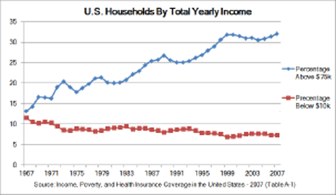
Line graphs typically display the relation between variables over time. In Figure 19, notice that the x-axis is in years. Time is a common set of independent variables against which the dependent variables on the y-axis are compared. Line graphs generally do not display exact values very well. The audience must estimate the exact values by approximating the position of the line on the x- and y-axes at a given point. However, line graphs display trends in the data over time (or other independent variables) more effectively than bar graphs.
Bar Graphs
Bar graphs display the values of multiple variables and are well-suited for comparing variables to each other along an axis of independent variables (See Figure 20). Like line graphs, the exact values at specific points on the bars must be estimated, but bar graphs effectively represent comparisons between groups or be-tween groups over another variable, like time.

Keep in mind that there are many line and bar graph formats and styles to choose from. The right one for your document depends on the variables you need to represent and the desired appearance of the graph.
When designing a graph, ask yourself:
- Who is my audience?
- What do I want my graph to say to them?
- Which type of graph will be most effective at conveying the data accurately?
- How should that graph look?
Do some research, look at examples, and select the graph for-mat and style that best suits your data and your audience’s needs.
Charts
While graphs let you see how variables interact with each other, charts allow you to visualize relationships of individuals parts within a whole. There are a variety of charts to choose from depending on your purpose.
Pie Charts
Pie charts (See Figure 21) are easy to interpret and visually ap-pealing, but do not display complex dynamics well. They visualize ratios efficiently, but they can reduce complex issues to percentages of a single variable. If you have one variable and you want to show ratios of the variable, a pie chart may be the right choice. However, always con-sider whether the pie chart oversimplifies the issue or condition being presented by highlighting only one variable, and then consider whether the oversimplification renders the data in the chart misleading.
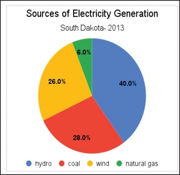
When designing pie charts, you also need to consider color and texture. The effectiveness of the visualization depends on the ability of your audience to easily identify parts of the whole. Consider whether the pie chart will be printed in black and white or color, and whether you will need to add texture or grayscale to ensure that all pieces of the pie are clearly visible.
Effective pie charts should:
- Display the exact percentages for each segment
- Add up to 100%
- Include at least two segments (charts may become overly complex if you include too many segments).
Organizational Charts
Organizational charts divide things, such as organizations, into multiple parts of the whole, however, unlike pie charts, the organizational chart can show relationships between the parts. For a typical business setting, the top of an organizational chart would contain the president or CEO of a company, and the bottom would contain the lowest level employees, displaying a hierarchical structure (See Figure 22).

Flowcharts
Flowcharts typically describe a process from start to finish, accurately displaying things such as algorithms and workflows (See Figure 23). You probably have seen many of these throughout your lives.
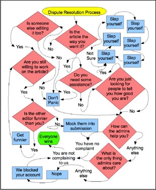
Flowcharts are frequently used to display multiple possible decisions and outcomes as part of a process. A flowchart is deterministic or causal—that is, the choice made determines the response.
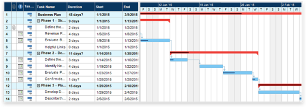
Gantt Chart
Gantt charts are used to display a process as a function of time. Gantt charts map out the total amount of time to be spent on a process or project, and then break that time up into segments that visualize specific tasks to be completed during specific time periods along the project timeline. This type of chart displays the steps needed to complete a project, allocates the amount of time needed to complete each step, and represents both concurrent and consecutive tasks. Gantt charts are useful in project management and proposals. If you have used Google Calendar or a similar digital calendar system, then you have turned your life into a Gantt chart.
If you’re not sure where you could incorporate a figure, remember that charts and graphs are just another way of presenting the same data that is presented in tables. The advantage of graphs and charts is that they are more dramatic and interesting; however, this strength may come at the cost of detail or precision, where tables excel. Imagine the difference between a table of sales figures for a ten-year period and a line graph for that same data. In the graph, you get a better sense of the overall trend but not of the precise dollar amount.
Illustrations, Diagrams, and Photos
To depict objects, places, people, and the relationships between them, you can use photos, drawings, diagrams, and schematics.
Major types of illustrations and photographs run from minimal to maximal detail. A simple line drawing of how to graft a fruit tree reduces the detail to simple lines representing the hands, the tools, the graft stock, and the graft. Diagrams are more abstract, schematic views of things; for example, a diagram of a car engine hardly resembles the actual physical thing at all.
Illustrations
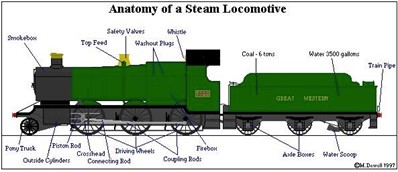
Illustrations allow you to show your audience representations or depictions of places or objects. By using illustrations in your documents, the audience can better understand the relationship between the appearance and information. For example, a labeled illustration of a locomotive would identify the parts of the locomotive as demonstrated in Figure 25.
Types and Placement of Callouts
Callouts typically take one of three different forms:
- They may be placed directly on the graphic (whereby they become part of the visual),
- They may be placed around the graphic near lines that point to the relevant element in the graphic, or
- They may include links or hotspots where more information about the element is displayed on mouse rollover or on another page. The visuals below feature two of the three major label types.
Callouts are best used when many parts of the image need to be labeled, and each part requires a longer explanation. In fact, the label sequence may be in alphabetical or numerical order as shown in the example below. Ensure that the explanation is near the graphic.
Diagrams
Diagrams and illustrations are a great way to give readers a big picture layout of devices, parts, and components. The more visuals you include, the fewer words you have to use. They are also especially good at breaking down hard-to-see or hidden elements, like the wiring schematic of a car.
Here’s an example diagram of an analog mixer (Figure 27), an extremely complex machine with lots of hookups, plugs, and doodads. This great diagram clearly shows what those plugs do:

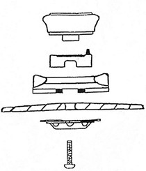
Not all diagrams are effective. Often bad diagrams can outnumber the good ones. Most of the time diagrams fall short because they are not descriptive enough, poorly rendered, too cluttered or do not have enough written explanation. For example, see Figure 28. How would you explain what’s going on here?
A diagram with too little information, like one with too much information, is not helpful to your audience.
Photographs
Photographs, of course, provide the most detail of all. These graphics, supplying gradations of detail as they do, have their varying uses. Here are some examples:
- In instructions, simple drawings (often called line drawings because they use just lines, without other detail such as shading) are the most common. They simplify the situation and the objects so that the reader can focus on the key details.
- In descriptions, you would want to use drawings, but in this case drawings with more detail, such as shading and depth perspectives.
- In feasibility, recommendation, and evaluation reports, photographs are often used. For example, if you are recommending a photocopier, you might want to include photos of the leading contenders.
Basic Guidelines: A Review
Here are some basic guidelines to keep in mind when dealing with professional writing:
- Add and vary graphics. For non-specialist audiences, you may want to use more graphics—and simpler ones at that. Documents geared toward the non- specialist tend to have more decorative, technical, and detailed graphics.
- Break up text or consolidate it into meaningful, usable chunks. For non- specialist readers, you will likely construct shorter paragraphs of around six to eight lines. Technical documents written for specialists will include much longer paragraphs.
- Use headings and lists. Readers can be intimidated by dense paragraphs of writing.
(Technical writers may refer to a long paragraph that is difficult to scan as “a wall of prose.”) Incorporate headings whenever possible—for example, when a topic or subtopic is introduced. Also search your document for written lists that can be made into vertical lists. Look for paired listings such as terms and their definitions; these can become two-column lists.
- Use special typography. Typically, sans-serif fonts, such as Ariel, are useful for online readers. Serif fonts, such as Time New Roman, are useful for print texts.
- Work with margins, line length, line spacing, type size, and type style. For non-specialist readers, you can increase readability by making the lines shorter (adjusting the margins) and using larger type sizes.
- Include bullet points. Long lists can often be broken down into smaller bulleted chunks of information for ease of reading. Some genres, like the résumé, place the emphasis on bulleted phrases rather than complete sentences. When using bullet points, keep in mind the following:
- o Use a lead-in to introduce the list items and to indicate the meaning or purpose of the list (and punctuate it with a colon).
- o Check spacing, indentation, punctuation, and caps to ensure
- o Make list items parallel in
- o Confirm that each item in the list is parallel and grammatically
- o Avoid overusing lists; using too many lists destroys their effectiveness
- o Use similar types of lists consistently within the same
- Strive for balance and parallelism among elements. Keep in mind that items at the top of a document weigh more than those at the bottom, while items on the right side of the page weigh more than those on the left. Text and graphics should work together to create a sense of balance and unity.
In summary, while these basic guidelines may be applied to many different documents, the individual decisions you make will depend on your audience, or who will read your report. From content and language to layout, every aspect of your communication must keep your readers’ needs in mind.
Preparing Readers for Graphics
When developing graphics, you will want to consider where they should be placed and what information should surround them. Make sure your visuals are appropriate to your audience, subject matter, and purpose. To prepare readers for the information a graphic conveys, also consider these tips:
- Explain or introduce the information/topic of the graphic in the preceding paragraph.
- For easy reference, give each visual a name.
- Make sure the information within the graphic is clear and easy to understand.
- Whether above the visual or somewhere else in the document, provide source information, references, or citations (if the visual and/or data is not your original work and comes from a secondary source).
- Include a caption or follow-up text after the graphic, such as an interpretation or a final comment about the implications of the visual. If the graphic contains extensive data, you may need to tell your audience what information to focus on.
- Intersperse graphics and text on the same page. Avoid placing graphics on pages by themselves; ideally, no visual should take up more than one-third of a page unless absolutely necessary.
- Include identifying details within the graphics such as illustration labels, axis labels, keys, and so on.
- Leave at least one blank line above and below graphics.
- Place graphics near the text that they are illustrating. If a graphic does not fit on the same page, indicate that it appears on the next page.
- Cite all images that you take from elsewhere. While it is perfectly legal to borrow graphics—to trace, photocopy, scan, or extract subsets of data from them—you are obligated to accurately cite your sources for graphics. Also be aware that some graphics may require extra permissions from the creator based on the type of copyright.
Using graphics, charts, tables, diagrams and other visuals can help the reader understand complex information. Visuals should clarify, illustrate, and augment your written text but should not ever be a replacement for your text.
Media Attributions
- Private: Table 13: Sales figures 2008-2018
- Private: Figure 19: Sample Line Graph
- Private: Figure 20: Sample Bar Graph
- Private: Figure 21: Sample Pie Chart
- Private: Figure 22: Sample Org. Chart
- Private: Figure 23: Flowchart
- Private: Figure 24: Gantt Chart Example
- Private: Figure 25: Locomotive Graphic with a Label and Additional Callouts
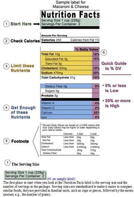
- Private: Figure 26: Food Label with Callouts
- Private: Figure 27: Mackie Onyx Analog Mixer
- Private: Figure 28: Sample Bad Diagram – Not Enough Information
